Impulse Billiards
website redesign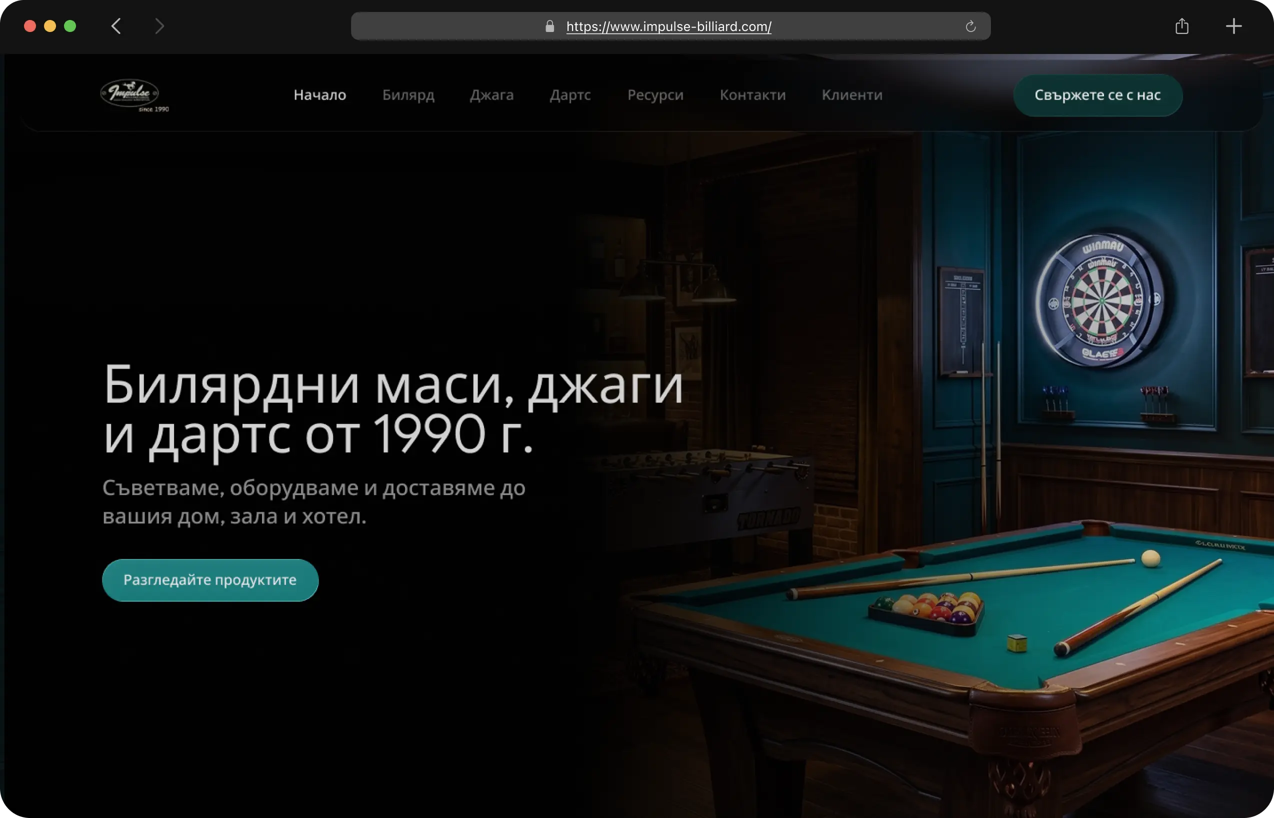
- role
- UX/UI & Web Designer
- project
- Website
- timeline
- 3 weeks
- date
- August 2026
- status
- In development
Knowing the problem is half the solution
After a detailed conversation with the client and carefully going through the website's architecture, I managed to pin point some crucial problems that needed my full attention:
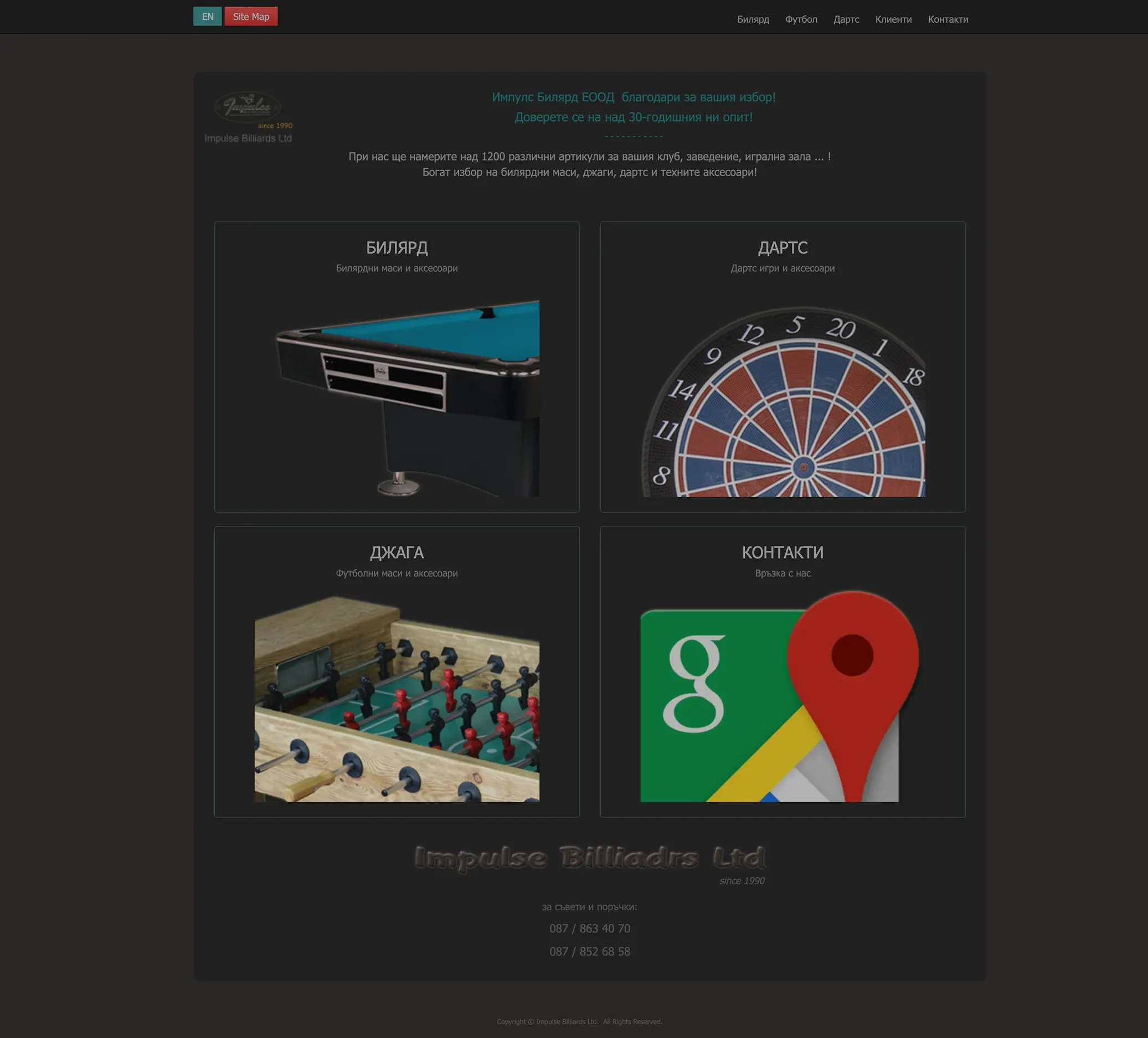
Outdated design
Compared to its direct competitors, Impulse Billiards felt outdated and neglected, lacking the modern, trustworthy presence customers expect.
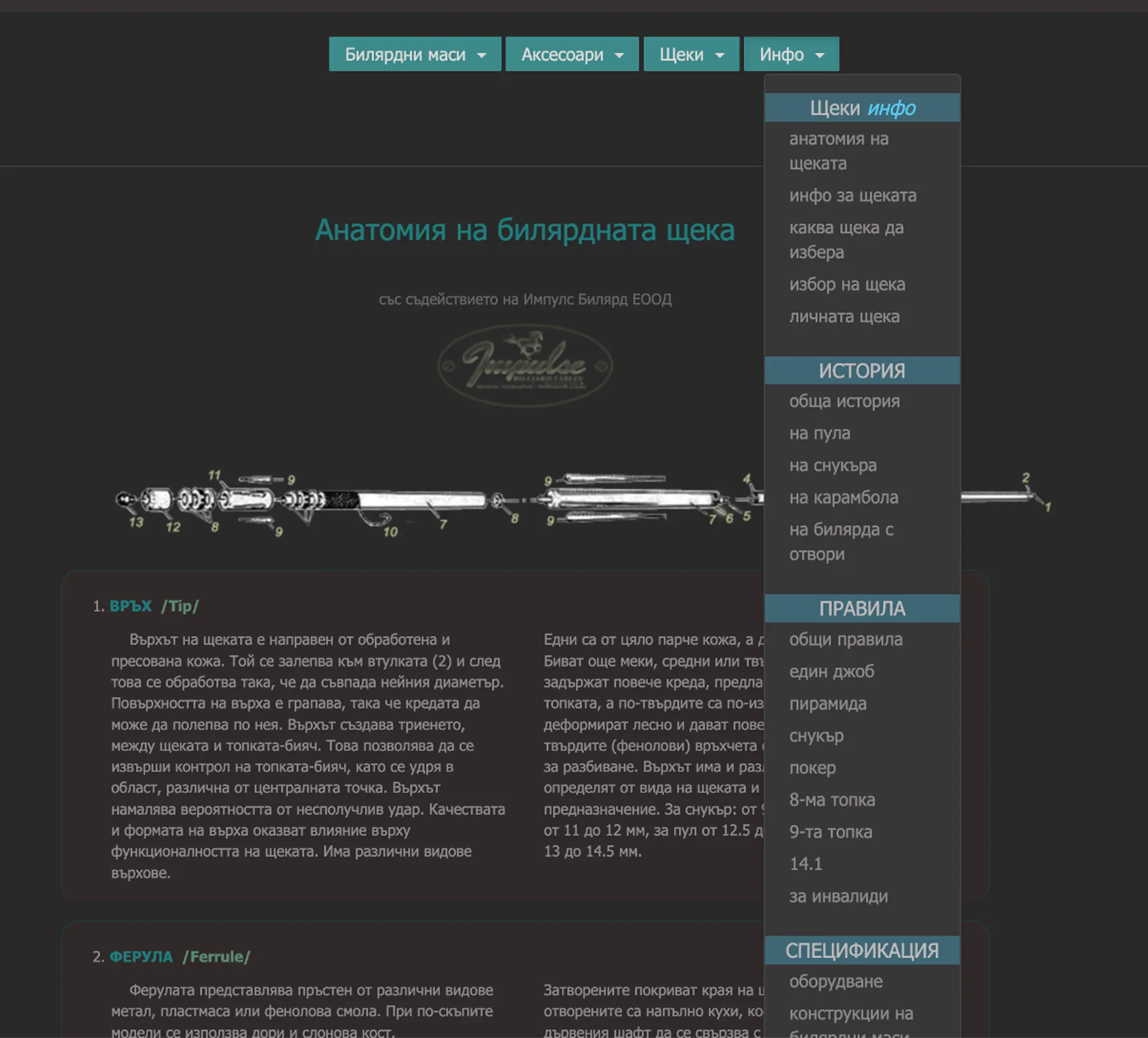
Tangled information architecture
Critical pages were buried under layers of irrelevant content, making key information nearly impossible to find.
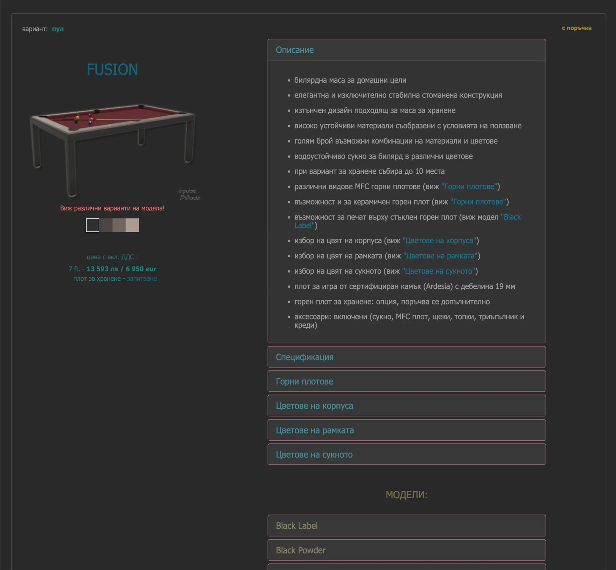
No clear CTA
As a client it is unclear how you can purchase the items you liked.
Trust left on the table
With 30+ years of proven expertise, hundreds of satisfied clients, and partnerships with premium brands — none of it was visible. The design buried the very proof points that turn browsers into real-life buyers.
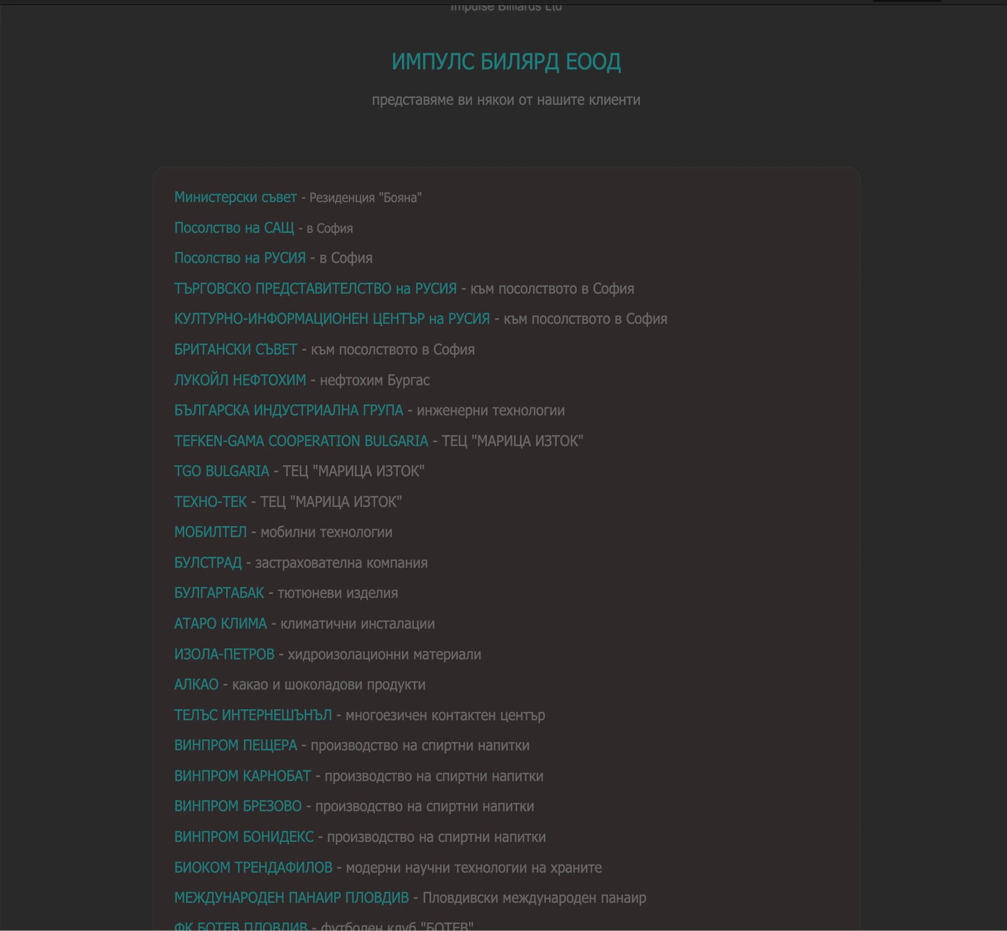
Constraints that shaped the work
No checkout, no cart. Contact is the only conversion event.
Dual BGN/EUR pricing through Aug 2026
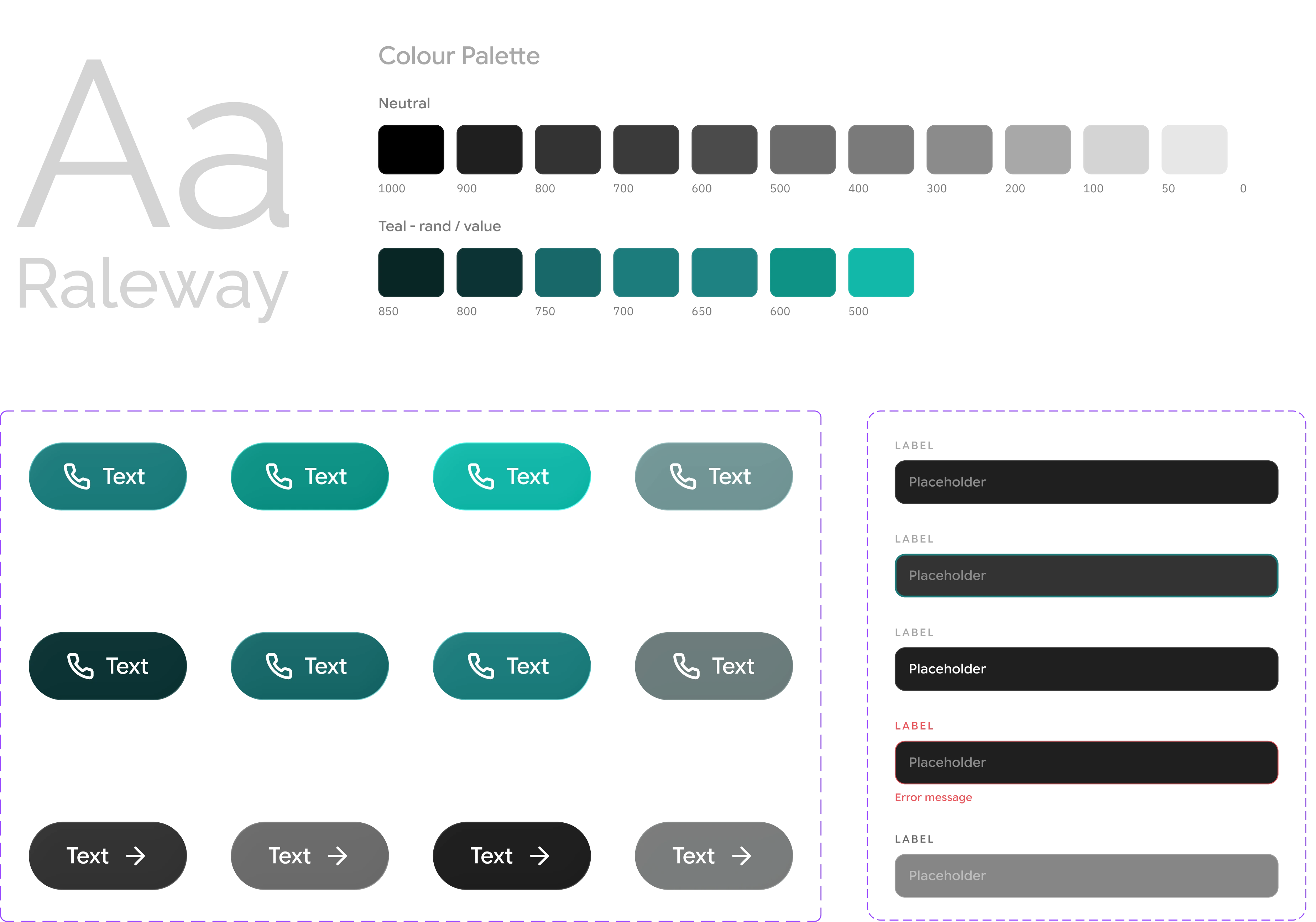
Keeping the current dark theme and teal accent colour pallete.
Same vibe, fresher look
I managed to keep the old colour palette since it was already part of the brand identity. Bringing the feeling of the old space into a refined, cohesive look — aiming for something sharp but still approachable. My focus was on refining the structure, improving flow, and giving the content room to breathe in a layout that fits this day.
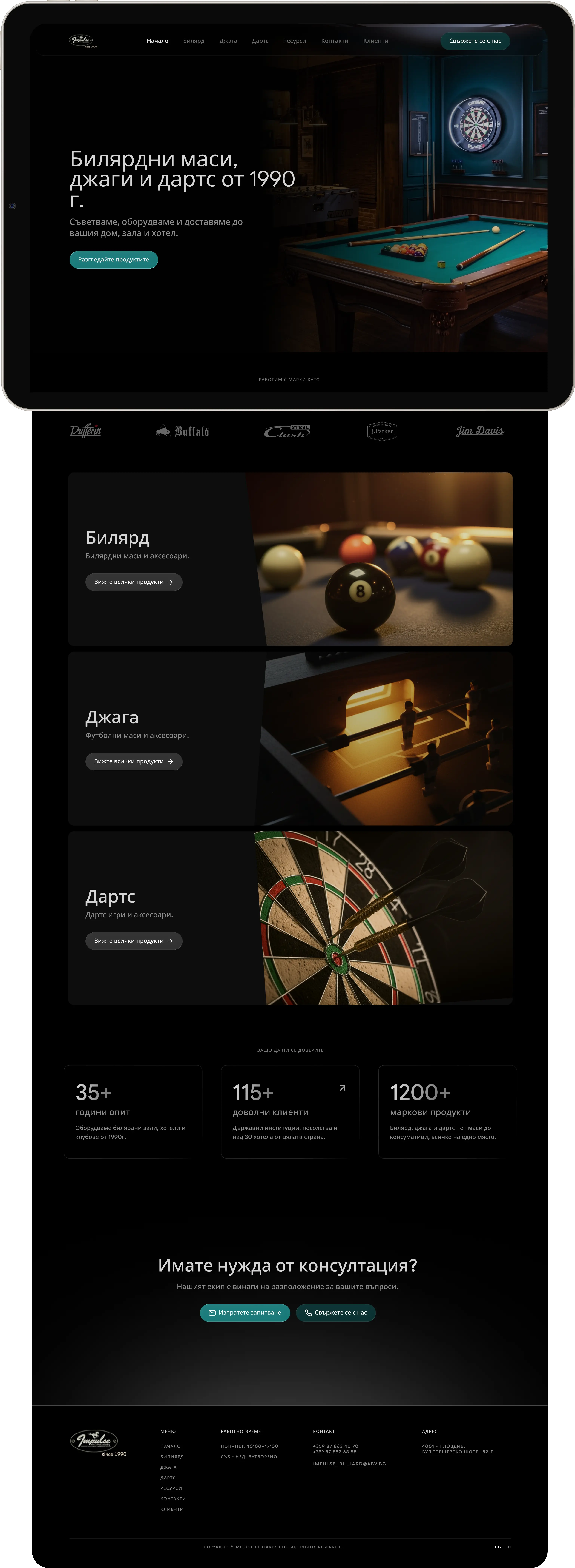
Key improvements
No way to directly navigate back to the homepage - only through opening the Site Map button.
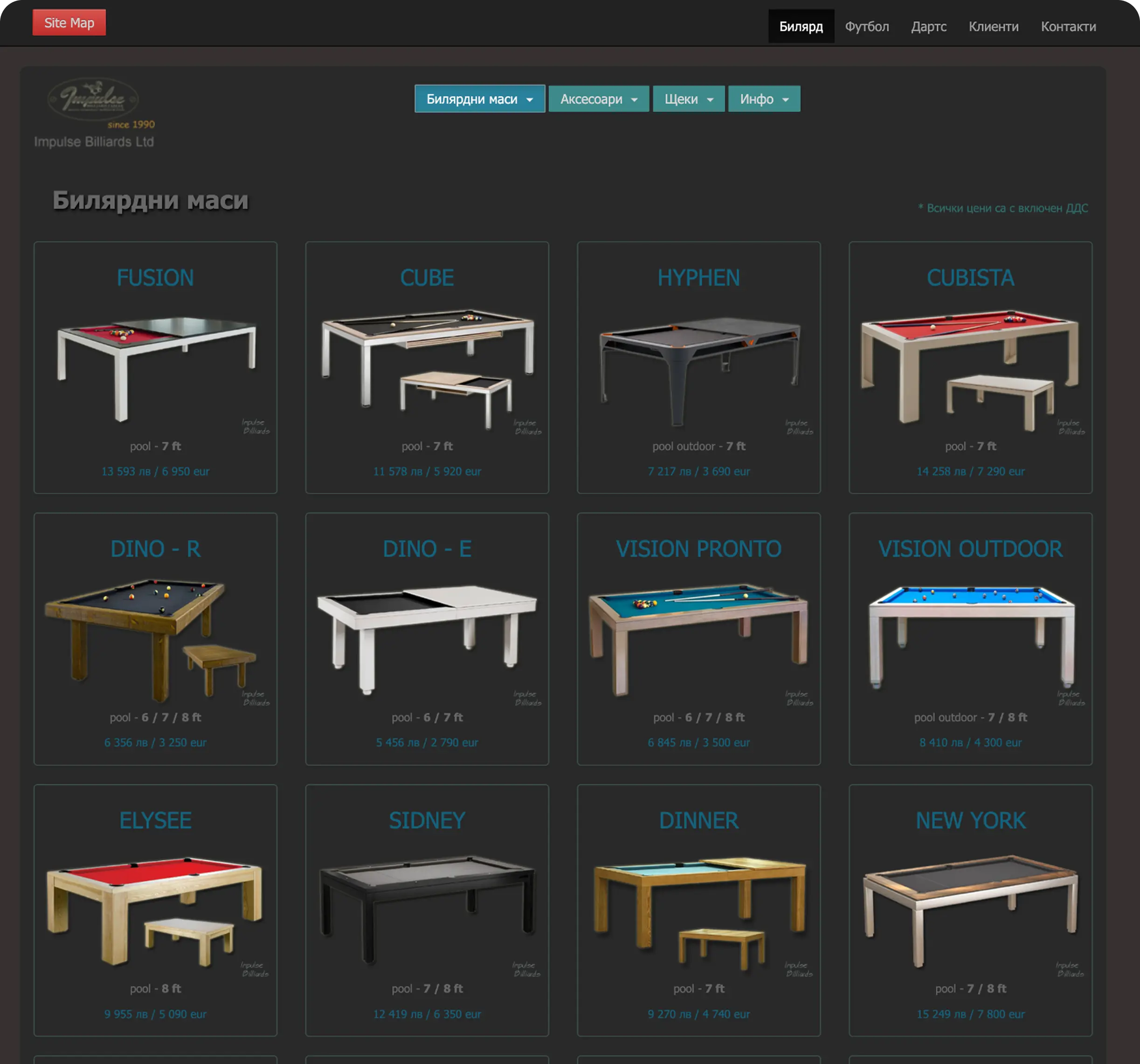
No filter and sorting options making it difficult for the user to navigate the subcategories and the general product list.