Freshko
website redesign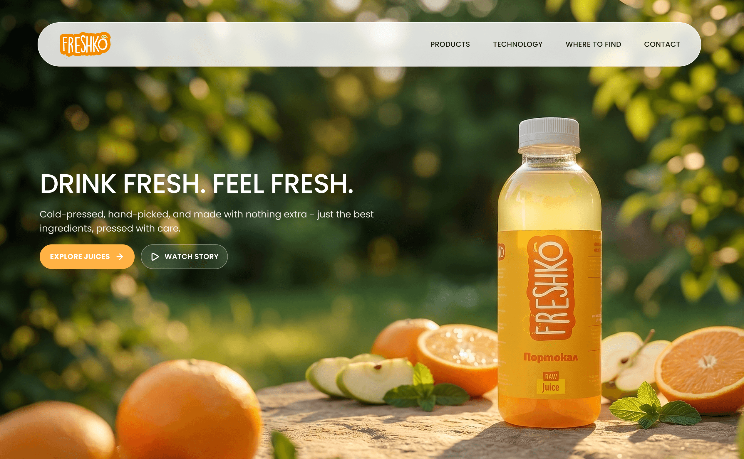
- role
- UX/UI Designer
- project
- Self-initiated redesign
- timeline
- 2 weeks
- date
- May 2025
I started by listening
Before touching the visuals, I ran a moderated usability testing where I sat with users in real time so I could analyse their behaviour, listen to their comments, ask follow-up questions and watch problems happen. As expected, it gave me far richer, more contextual feedback than a survey would.
Site structure
Disorganised hierarchy made product discovery frustrating.
Conversion blockers
Users abandoned flows when they hit broken links or unclear next steps.
Brand perception
Visual design did not reflect the premium nature of the products.
I also mapped two distinct audiences whose needs barely overlapped — retailers vetting Freshko as a supplier, and end clients just trying to find a flavour and where to buy it. The old site served neither well.
Wholesale Partners
Looking for:- Sourcing details
- Bulk pricing structure
- Quality certifications
- Distribution logistics
- Partnership terms
Individual Consumers
Looking for:- Product ingredients
- Retail locations
- Brand story
- Subscription options

Where competitors fell short
I ran a competitive analysis against similar juice brands to separate what's now table-stakes from where there was room to stand out.
Time for an audit
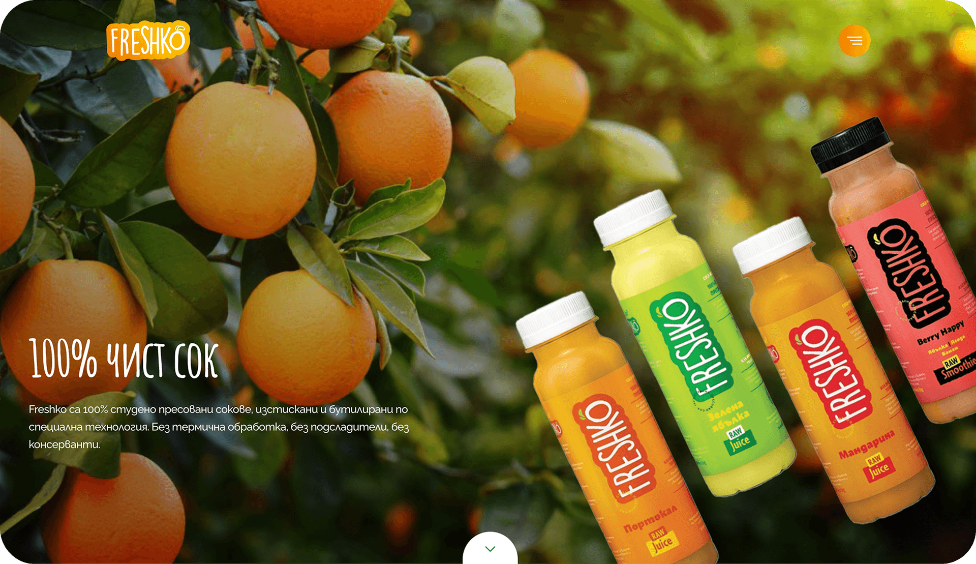
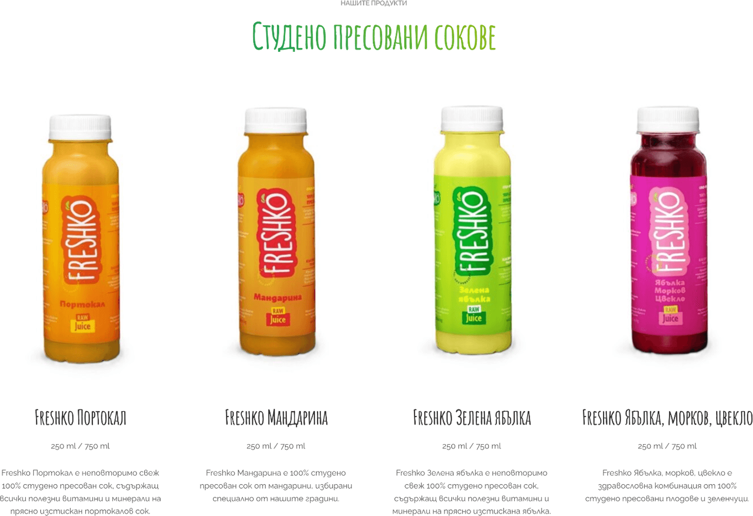
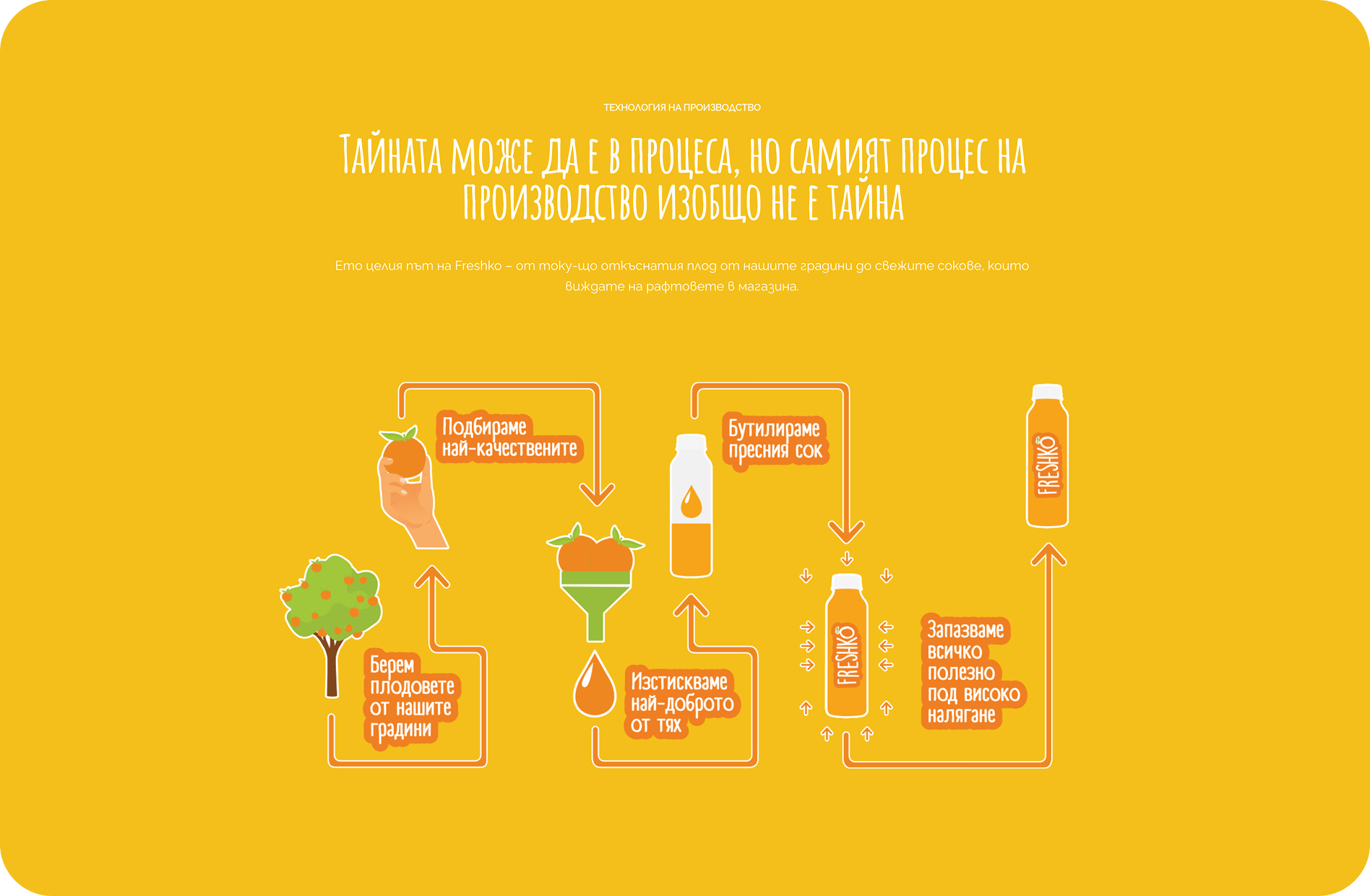
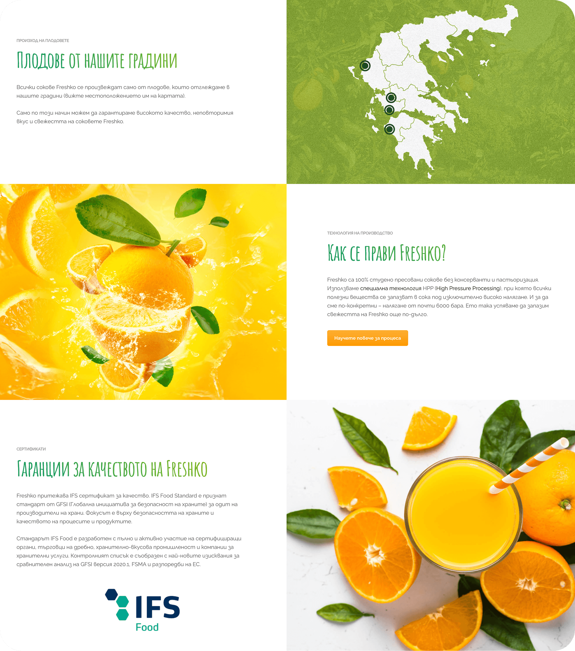
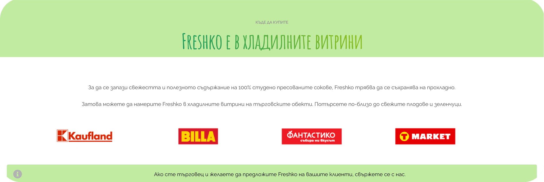
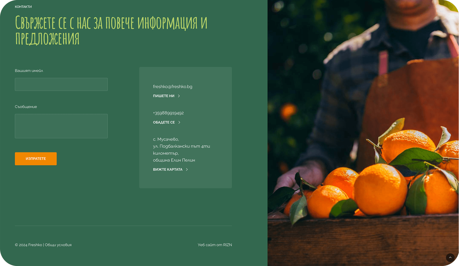
I audited the existing website in seven parts: Hero, Product list, Advantages, Technology, Additional info, Where-to-buy, and Contact, annotating every usability and accessibility issue and pairing it with a fix. This turned a vague 'it feels off' into a concrete, prioritised work list.

Wireframing the new flow
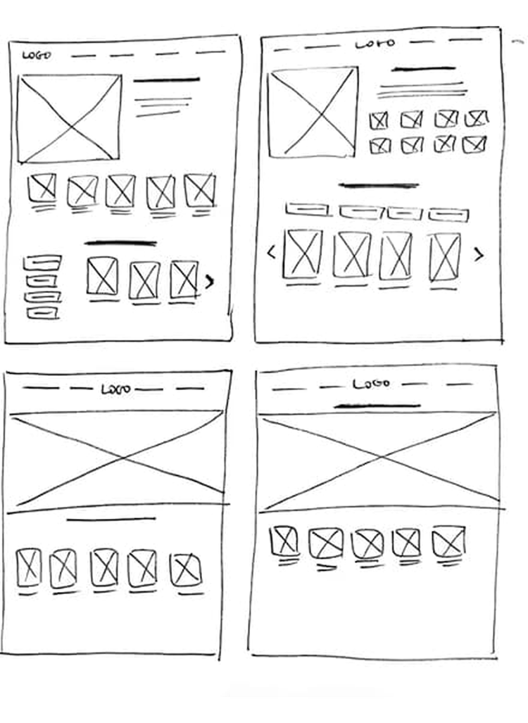
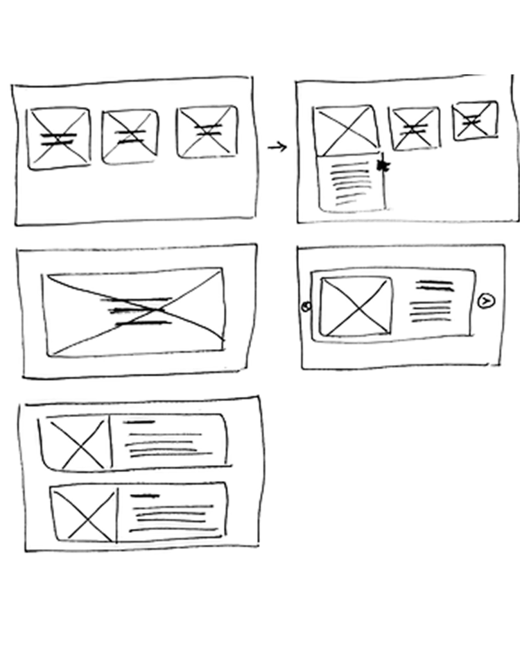
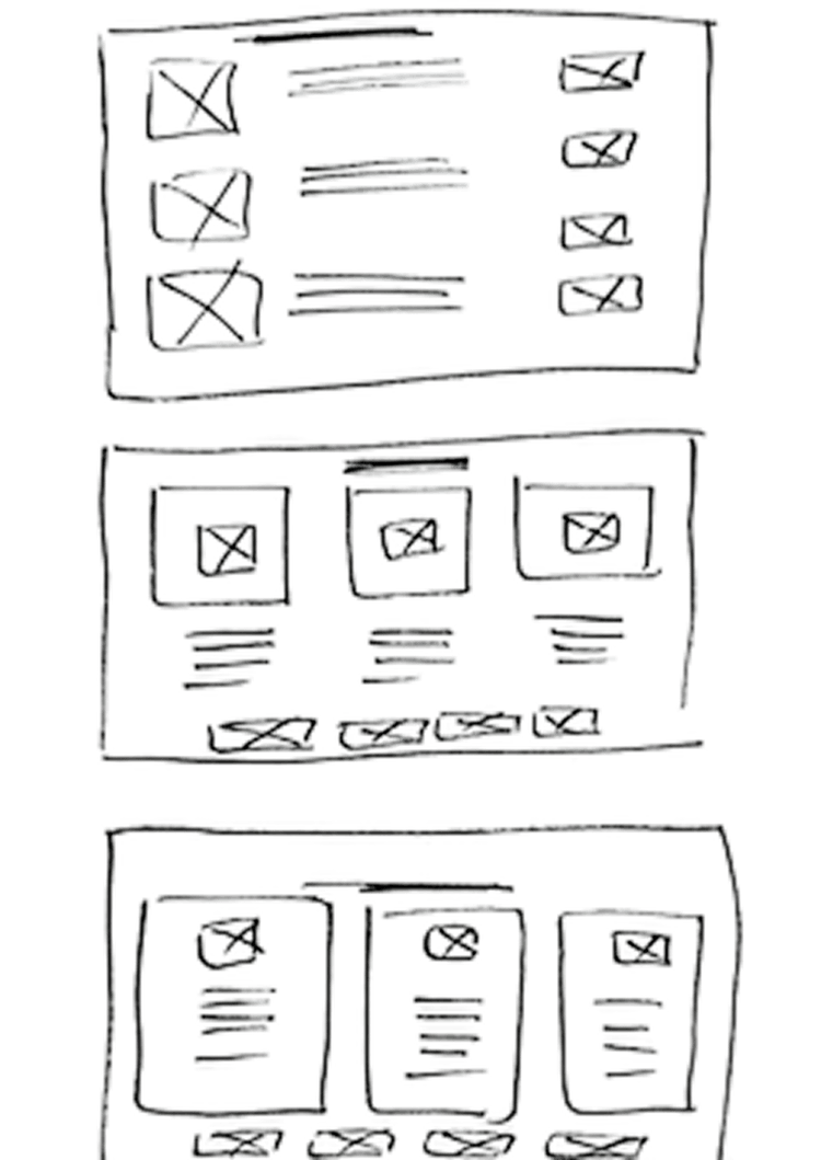
I sketched several directions for the hero and product menu, then committed to a full digital wireframe before adding any colour.
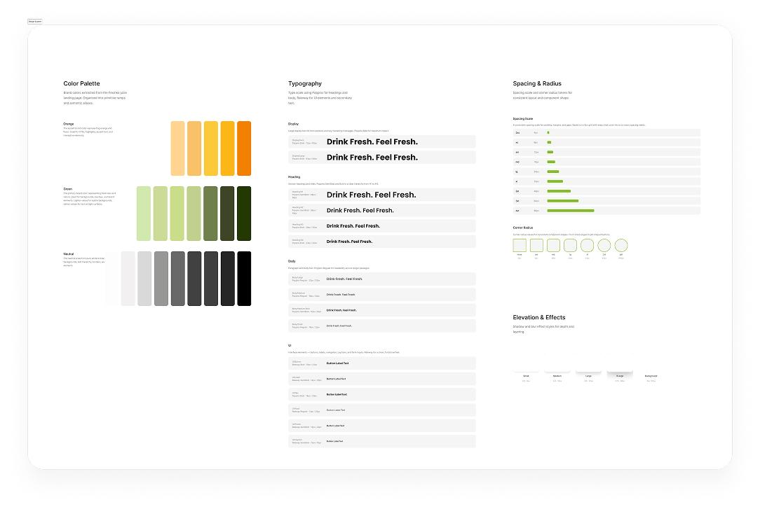
Fresh design system
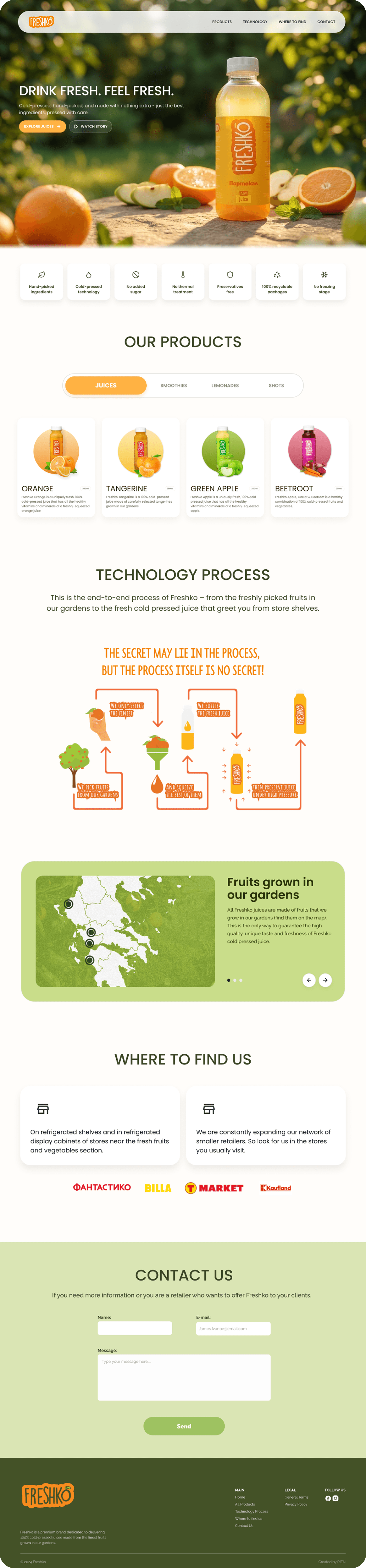
The redesign - one decision at a time
Every change traces back to a finding. The menu became easy to scan; flags became labelled language abbreviations for colour-blind users; product photos were re-shot at higher quality; selling points and the technology process moved up and got room to breathe.
Reflections
Separate assumptions from user needs
Early testing showed users approached the product differently than I expected - a reminder to let research lead, not personal bias.
Accessibility is a mindset, not a checklist
I learned to prioritise inclusive design before aesthetics - and let it shape the palette from the start.
Iterative design is crucial
Fast cycles of prototyping and testing surfaced insights faster than polishing a single solution ever would.
Clean visual hierarchy
The typographic scale and whitespace create a natural reading flow that guides the eye without competing elements.
Consistent card system
The repeating card pattern with uniform padding and structure creates visual rhythm and scannability.
Strong content strategy
Each takeaway is concise and actionable — titles hook attention and body text delivers real insight.
Add more visual variety
The uniform card layout works well but introducing subtle variation in size or imagery could create more visual interest.
Strengthen the colour palette
A bolder accent colour or gradient touches could add energy and draw attention to key moments in the page.
Include more tangible evidence
Adding metrics, before/after screenshots, or user quotes would ground the takeaways in concrete results.