Playing “dirty” wasn't an option
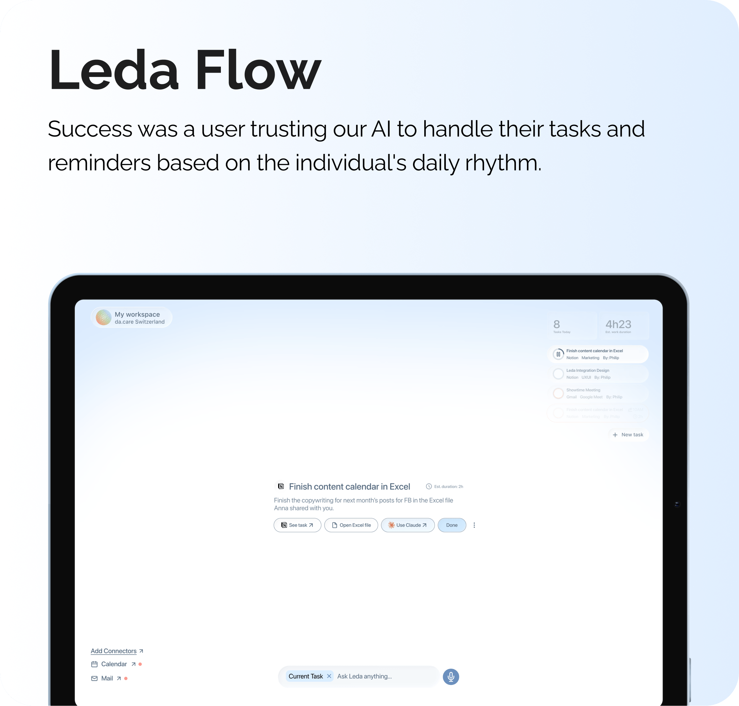
Before any wireframes were made for Leda and Leda Flow, first I needed to understand what these products were competing against.
Through competitive audits, app teardowns, and user reviews, I looked at the general and wellness app market and the pattern was clear: most competitors optimise for time-on-app, not user wellbeing. Infinite scroll, emotional dependency, re-engagement notifications - the same mechanics that make social media harmful had been imported wholesale into wellness.
Engineered to Hook You
Infinite scroll, auto-play, algorithmic feeds - every pixel designed to kill your exit points and keep you locked in.
Hijacking Your Focus
Most apps bombard you with alerts engineered to pull you back - fragmenting your offline life to boost return visits.
Rewarding Time Spent, Not Time Well Spent
Points, badges, streaks - classic gamification disguises screen time as accomplishment.
Designed to Let Go
Sessions end on purpose. We measure success by how confidently you put the phone down.
Notifications That Read the Room
Circadian-aware AI delivers updates when they fit your rhythm - not when they interrupt it.
Tracking What Actually Changes
We measure real-world outcomes - health, focus, life. The best metric? How little you need the app.
da.care wanted the opposite. But wanting the opposite is not a design decision. I had to define what it meant concretely, per product, before anything was built:
Designing an AI app for my grandma
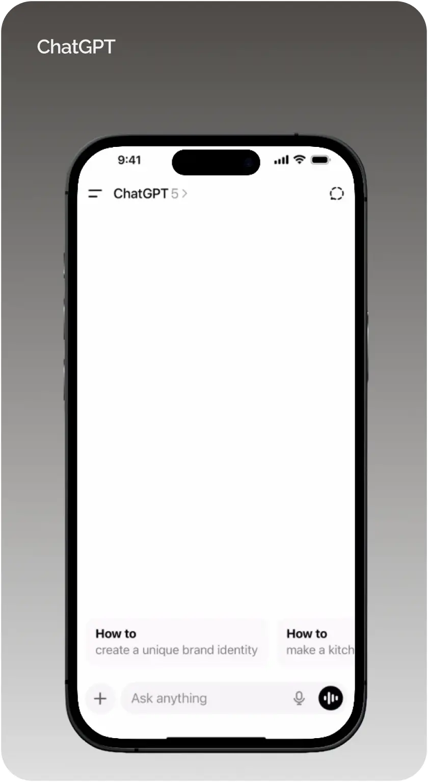
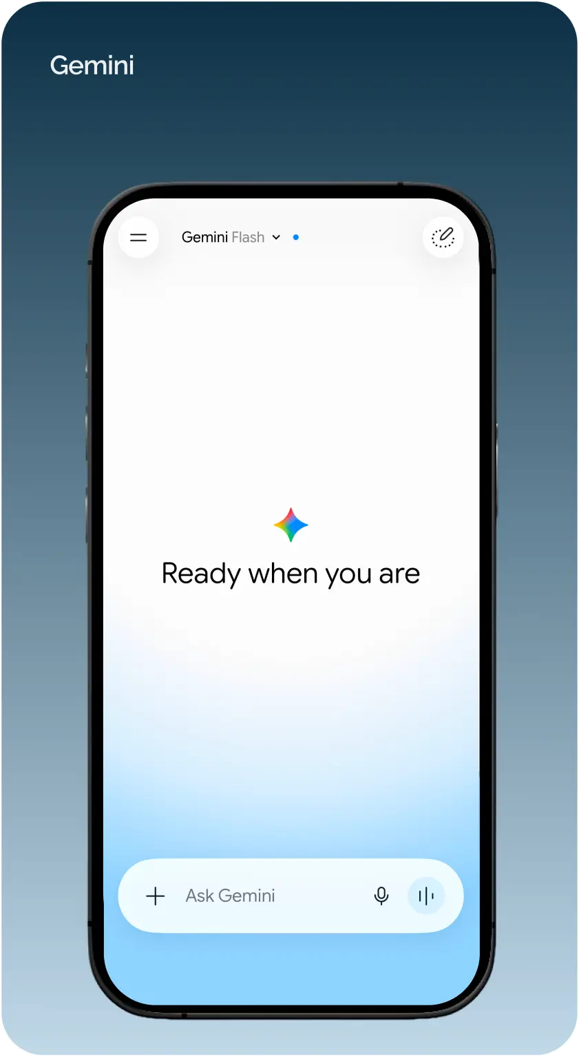
The first thing I noticed when I audited the competitor landscape was the blank chat screen - It appeared on almost every product. While more tech-savvy users could find the possibility of asking anything exciting, it was not the same case for our target audience: less tech-savvy people, including seniors. They arrived with no idea what to ask, what was safe to share, or what an AI chat app could even do. The only exception at the time (2025) was ChatGPT which had small conversation-starters in the form of cards.
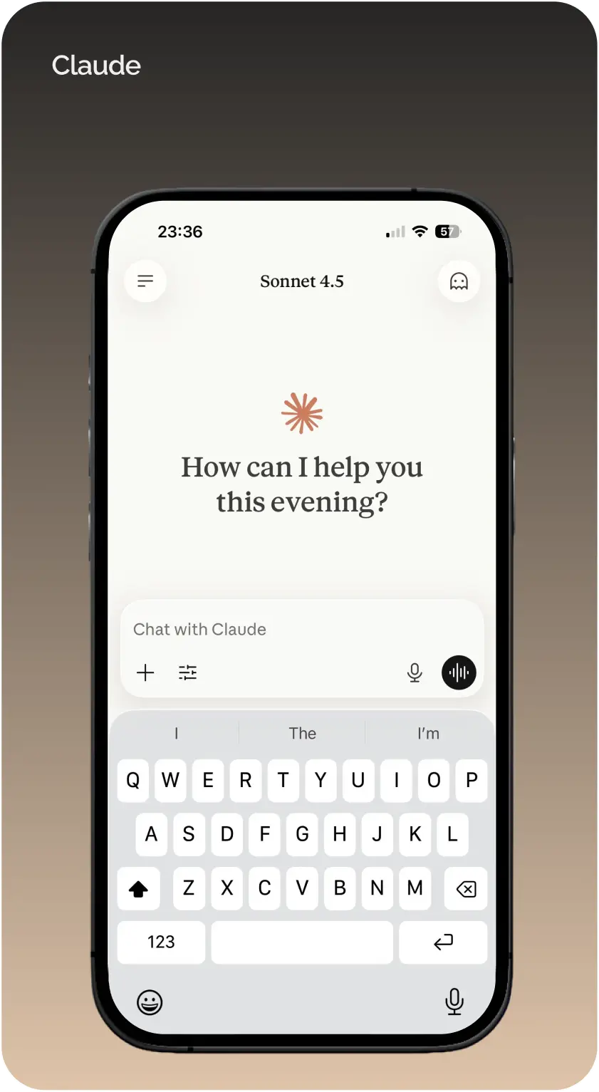
I hadn't run testing sessions with this age group directly yet, so I researched through existing reviews of age-tech and wellness apps aimed at older users. The pattern that came up repeatedly was navigation, not comprehension.
Older users didn't struggle to understand what an app did. They struggled to know where they were inside it. Confidence, not capability, was the real barrier.
Coming to that conclusion I asked myself: How can I make my grandma use Leda comfortably and confidently enough?
Thinking about it, almost anyone with a smartphone (including seniors) already understands the concept of a folder that opens to reveal apps you tap. So why not just build on the same principle and show our users a familiar screen they already know how to navigate around? And that decision is what reframed how I thought about structure.
4 folders
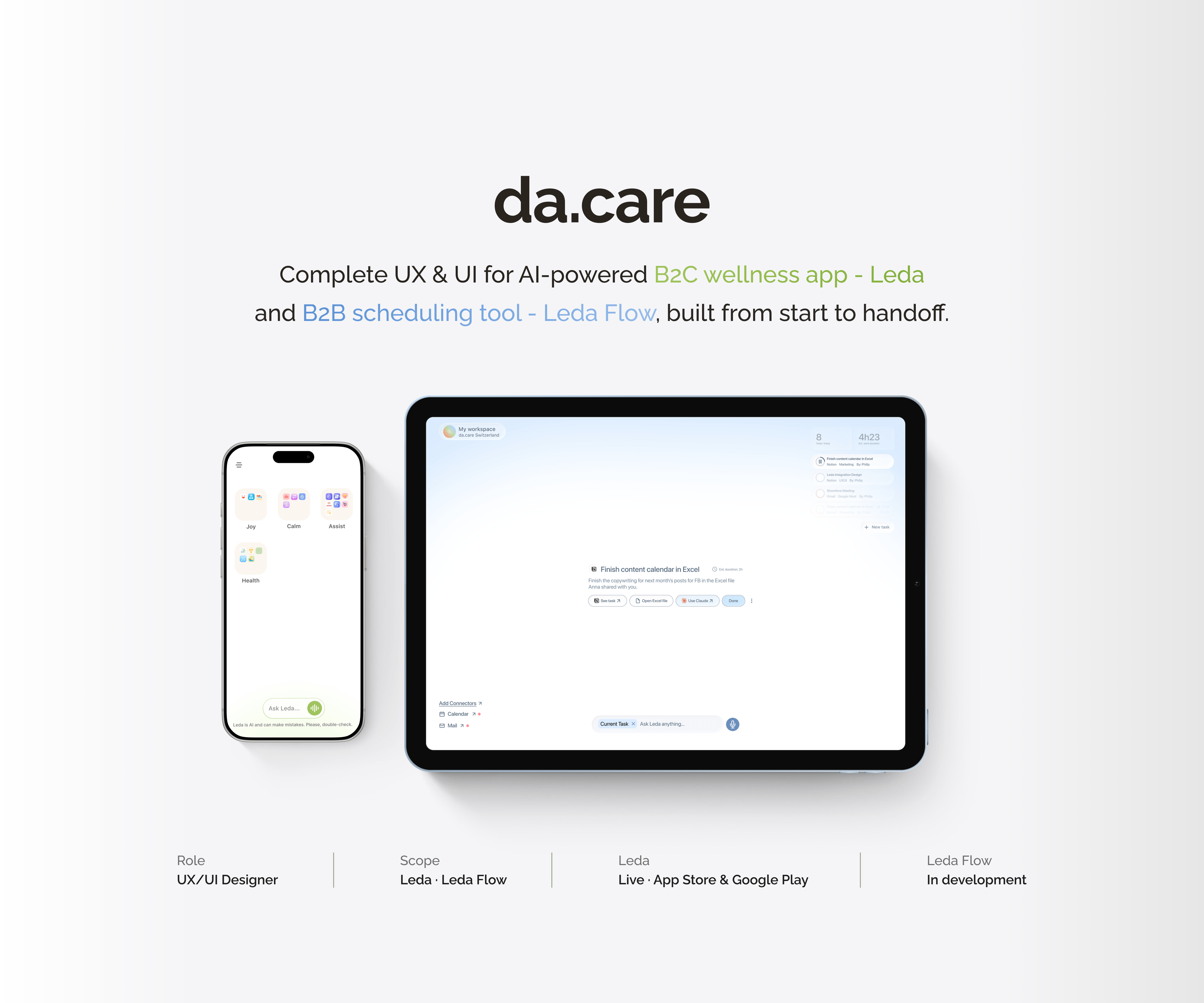
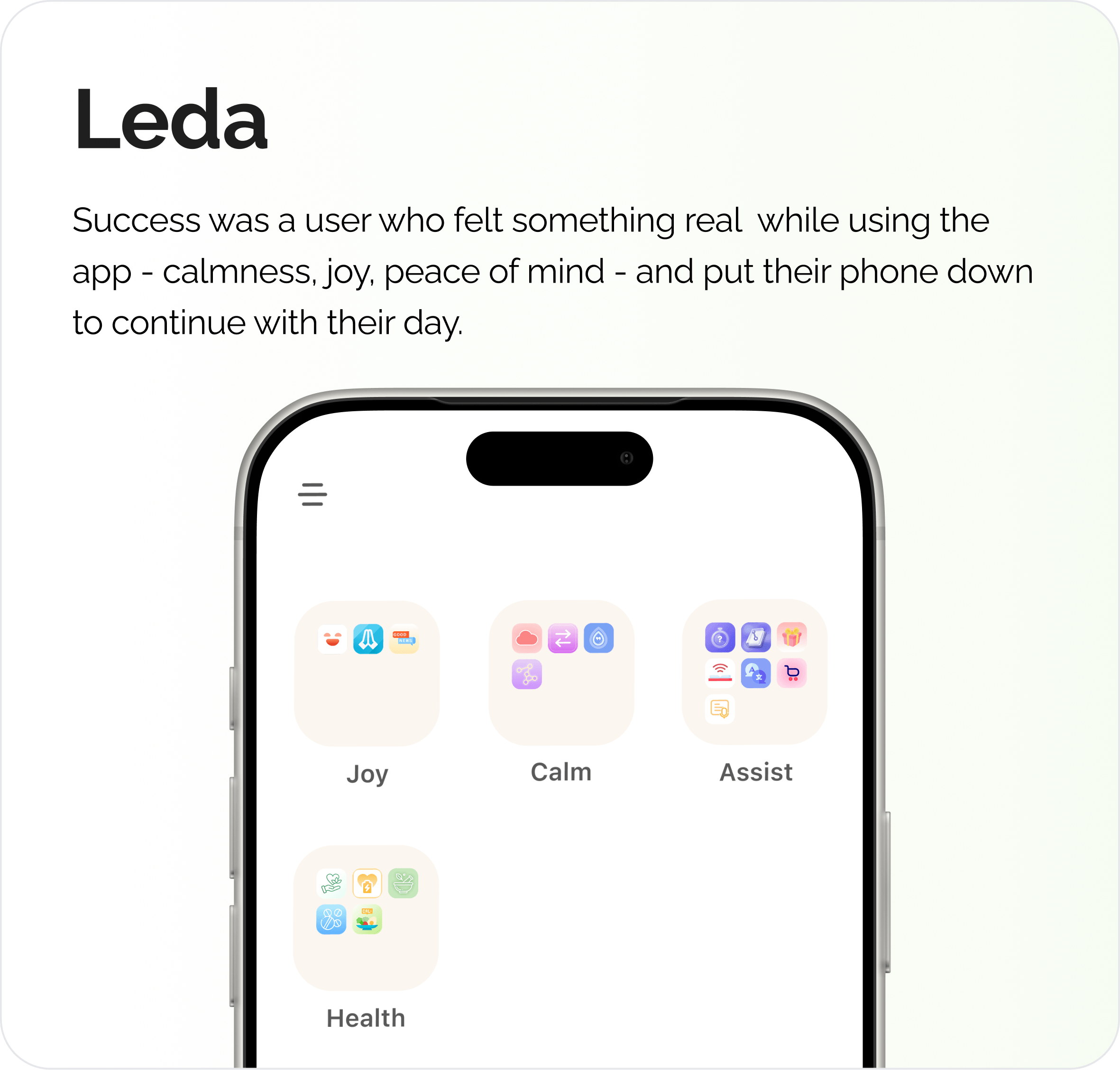
Leda is currently organised into four folders, each representing a need state a person can resonate with: Joy, Health, Calm, and Assist.
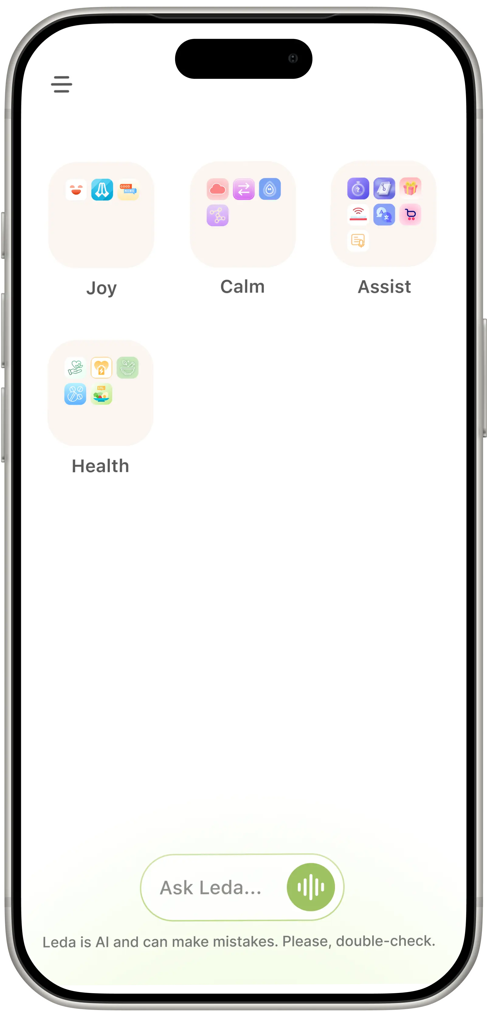
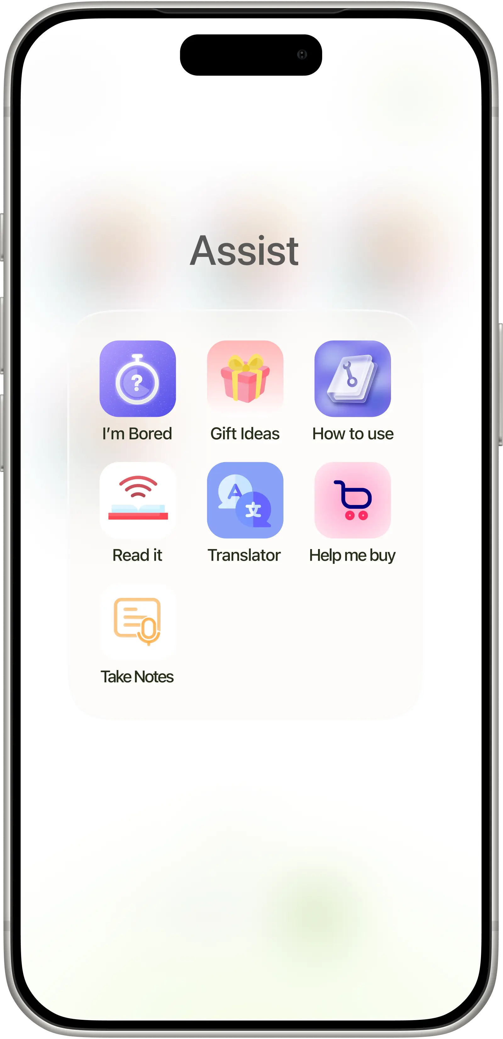
Mini-Apps to navigate
Inside each folder sit small, pre-built guided prompts, or "mini-apps" - bounded, structured interactions rather than an open-ended chat.
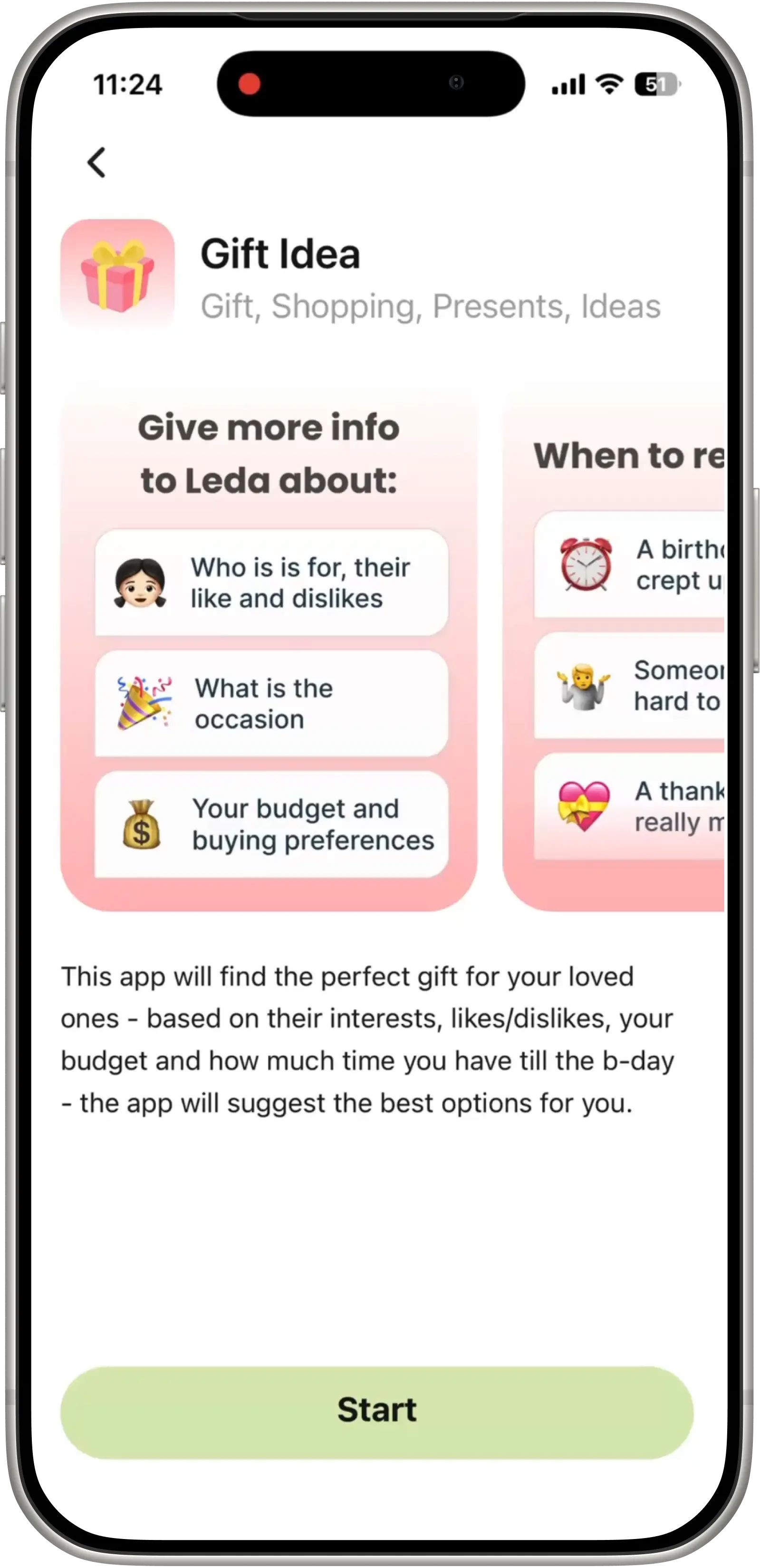
Personalised experience
Every mini-app gets tailored individually based on each user's needs, wants, likes and dislikes during a short onboarding process.
AI that actually gets you
In the end, you get Leda's helpful response right away - no matter whether you needed it to be your shopping assistant or tech support.
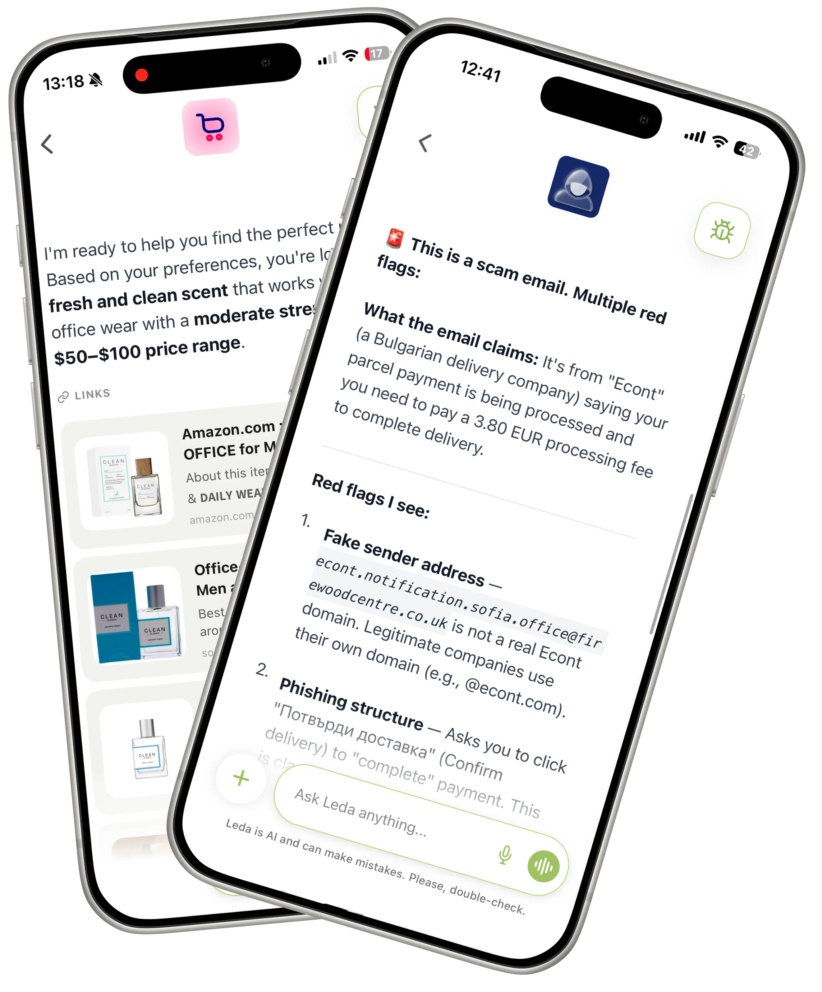
Considering our target audience, few decisions followed naturally:
16px default font size
no assumption anyone would hunt through a settings menu just to read comfortably
Calmer animations
nothing flashy or fast-changing; transitions had to feel steady, not jumpy
Concise copy
simpler language throughout, cut wherever a sentence could be shorter without losing warmth
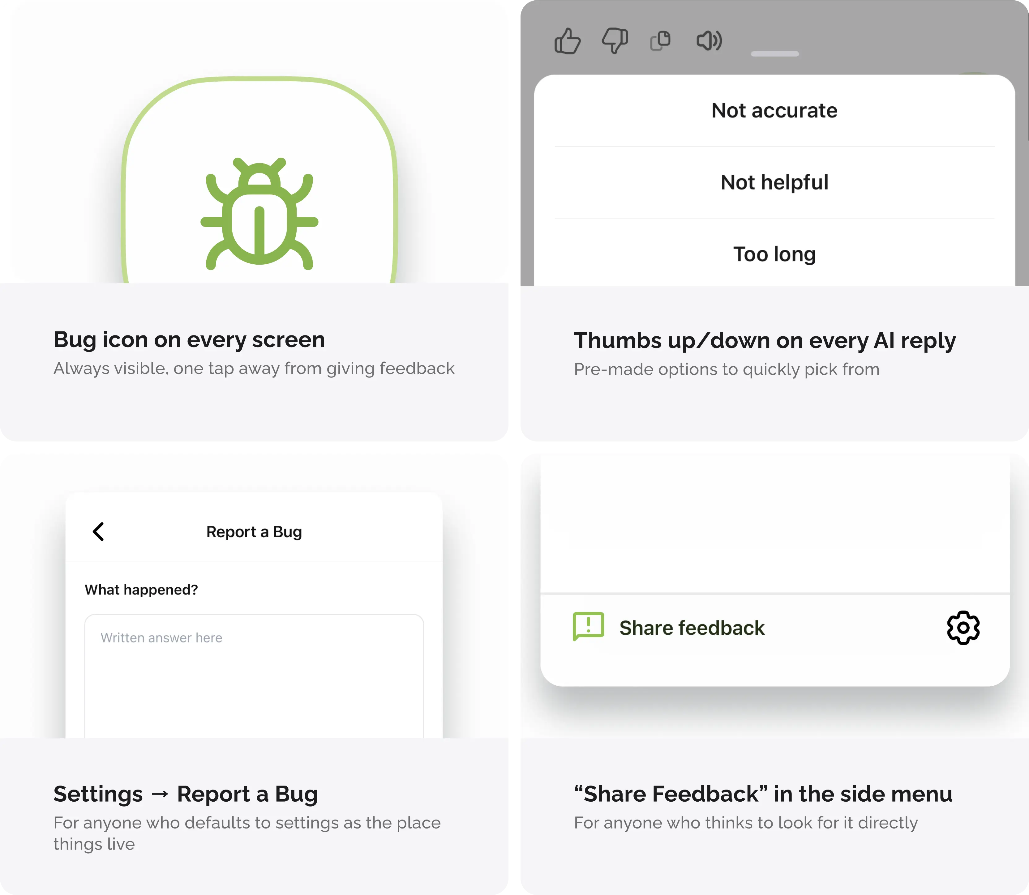
That same thinking shaped how I handled feedback. A single feedback form buried in a menu assumes a user who already knows to go looking for it. That's why separate entry points were needed instead - each surfaced at the moment feedback would naturally occur:
Designing against the playbook
The anti-addiction layer did not start as a feature. It started as an audit of every standard engagement mechanic, each one filtered by whether it served the user or just the metric.
No infinite feeds
Every mini-app has a beginning, a middle, and an end. No mechanism to keep scrolling.
15-minute usage nudge
Every quarter hour, the app surfaces how long you've been on it. The clock is visible by design.
No simulated companionship
No fake friendships, no emotional loops. Leda gives - it does not take.
No push-to-return notifications
Your re-engagement is earned, not engineered. No notifications designed to pull you back.
One system across three products
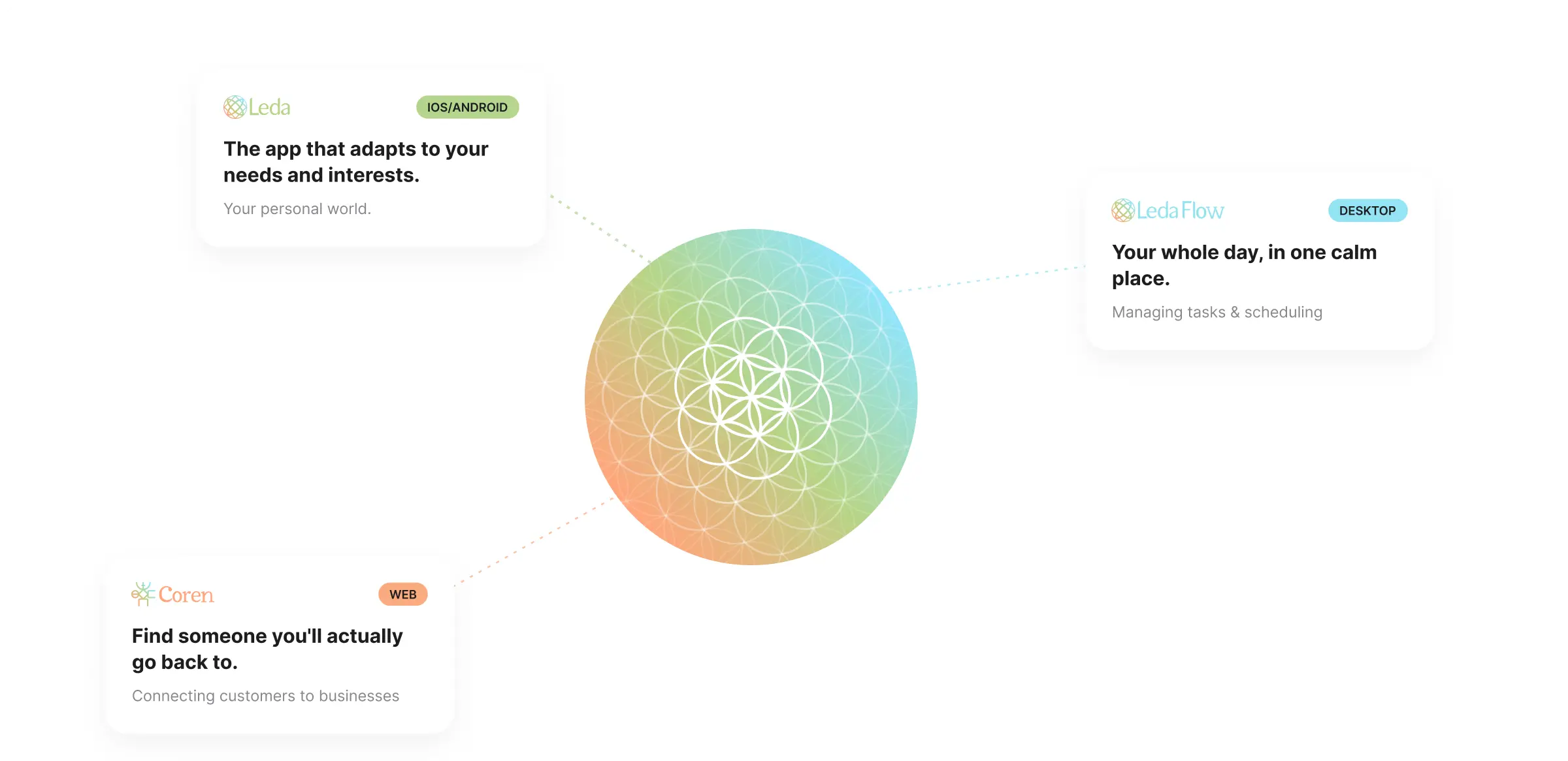
The colour system didn't start as a colour decision — it started with a logo problem. Leda Flow needed its own identity without fragmenting the da.care brand.
Since the da.care ecosystem consists of three products (Leda, Leda Flow, and Coren), I used the existing gradient palette from the da.care logo as a starting point. Each product was assigned its own colour, while remaining visually connected to da.care through the gradient language of their logos.
This decision helped both users and the team:
- · For the team colour-coding the products made navigating the design and implementation process faster and more intuitive
- · Users could immediately identify which product they were using
Making the privacy disclosure the pitch
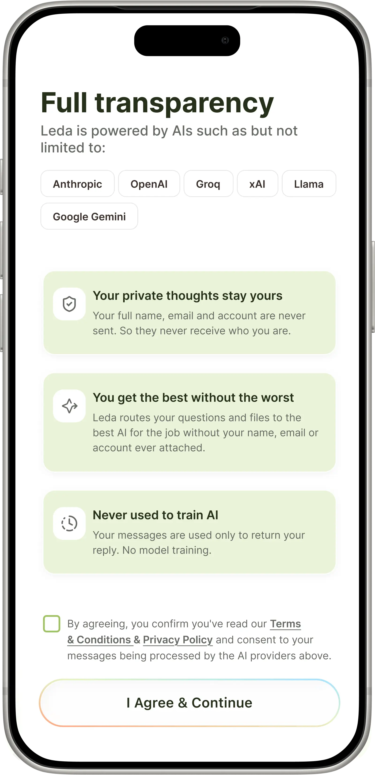
Apple required Leda to name every AI provider that handles user data. For a privacy-first wellness app, the plain version of that sounds alarming: your private thoughts go to six companies you did not choose.
I reframed the problem before touching the copy. The information was going out either way - the only question was whether it read as a confession or a promise.
I brought this rationale to the team, then rewrote the screen: every provider named, each obligation reframed as a benefit, consent unticked and explicit - never assumed.
Looking back